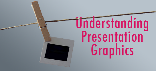
Although this piece of news could shock anyone involved in visual communication, I’ll say it anyway. It’s time to realize that audiences do not attend a presentation because of the slides. They attend because they want to hear what the speaker has to say.
With this in mind, let’s look at how and why an audience can benefit from presentation graphics. How can a designer or presenter know what to show on a slide? One straightforward approach is to first consider the purpose of the slide and then use a graphic that will meet your goal.
Meeting Your Goal
In their article, Visual-rhetoric Ethics (Manning and Amore), the authors developed a structure for thinking about visual strategies based on the rhetorical goals of philosopher Charles S. Pierce. In this approach, your visual strategy can encompass one or more of the following goals.
- Evoking Feelings: Through choice of color, typeface and other visual attributes, the purpose of your visual is to draw on the emotions. Visual strategies that correspond to this goal are called decoratives.
- Evoke Action: Another goal of presentation graphics can be to move an audience to take action. This is often done through the build of a bulleted list that will influence the audience to commit. These visual strategies are known as indicatives.
- Promote Understanding: A third reason for using visuals is to promote understanding through informative visuals like charts, graphs, diagrams and tables that express a concept. Visual strategies that promote understanding are considered informatives.
By identifying the purpose of the slide you can use this structure to ensure that your visual language is effectively communicating your goal.
Timing is Essential
It’s vital to leverage the synergy of a presentation and its corresponding visuals through perfect timing. Here’s why. Within the mind of your audience members, auditory information (flowing from the speaker) is most likely processed separately from visual information (projected from the slides). If the channels are synchronized, the audience can attend to one single concept.
If the presentation and slide graphics don’t match, the audience won’t know which to follow. If they attend to and process the words of the speaker, they’ll miss the point of the visual. If they focus on the graphic, they’ll fail to process the speaker’s words. If you don’t have a graphic for every point, simply turn the slide to black when discussing something unrelated. This is how you can avoid distracting the audience. See my article on splitting attention for more on this.
Enhance Meaning
Probably in the majority of presentations, the most important aspect of the slide visual is to promote and extend the audience’s grasp of the speaker’s words. This is usually accomplished with functional graphics that can add to and refine the internal knowledge structures or schemata of those in the audience.
For example, if a presenter such as myself, is explaining how we construct schemata as a framework for understanding, listeners might have a vague idea of what I mean. If I say, “Schemata help us generalize about the world, so your schemata for the concept house helps you recognize when a structure is a house,” they may still be slightly confused. If at the same time, I show a visualization of schemata for the concept house, it serves to clarify and refine the audience’s concept of internal knowledge structures.

Visualization of schemata for "house"
Every presentation involves a new audience and a nuanced topic, which means it’s incredibly important to think through the visual design of a talk each time it’s presented. If you determine the goal of each slide, identify a way to use a visual to promote meaning, and ensure the visual is synchronized with the presenter’s words, then you’ll be way ahead of the game.
Reference:
Alan Manning and Nicole Amare, Visual-rhetoric Ethics: Beyond Accuracy and Injury. Technical Communication, volume 53, number 2, May 2006.
Related Article:
How to Avoid Designs that Split Attention
Book Recommendation:
Presentation Zen Design
{ 4 comments… read them below or add one }
I can’t hear the presenter because I’ve shut down my audio channel while trying to visualize why paneling is connected to fireplace and porch is connected to interior and meals are connected to windows.
Hi Ed,
Thanks for contributing. Well, you’ve got a totally different issue! Try meditation or yoga to get yourself singly focused =)
lol. In my haste maybe I sounded grouchy because I left out the smiley. I would definitely choose to hear you speak because I enjoy your blog . The reason I read it? I’m in instructional design and consider it essential to understand the concepts of data presentation so that I may make the best choices when designing instructional messages.
I definitely get the point of your post but in this particular case my attention has been split by trying to resolve why Spanish and Federalist are connected to Architecture but Victorian is not. 😉
Not grouchy at all. I thought it was funny. Um … that theoretical visualization of what a schemata might look like is really just theoretical. I was just foolin’ around with ideas. Next time I get into Illustrator, I’ll connect Victorian to Architecture so you can sleep at night =)
And yes, data presentation for instructional designers is super important. That’s how I often come at it too. I’m going to be speaking at a few eLearning events coming up – eLearning Guild and ASTD in 2011 so maybe we can chat about visual communication and cognitive science if you’re attending. Also, you might be interested in the Society of News Design because of the infographics.
Best,
Connie