“If I get an email with words highlighted in red, I can’t see them.”
“I couldn’t spot an orange laying in my lawn.”
These are comments made by people with partial color blindness, the most common form of color vision deficiency.
It’s Not All Monochromatic
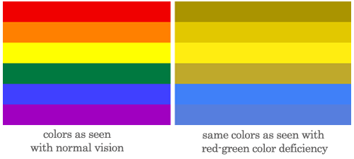
It’s a misconception that people with common color blindness only see in shades of gray. Their world is not like an old movie. Rather, common color blindness is the inability to perceive differences between certain colors. The most common type of partial color blindness results in difficulties discriminating between red and green hues. The “rainbow” on the right exemplifies what a person with red-green color blindness might see when looking at the rainbow stripes on the left (according to Wikipedia.) The second most common type is difficulty discriminating between blue and yellow hues. Total color blindness is much more rare.
Design Considerations
An important fact to consider is that 8% of the male population has some form of color blindness. That’s a lot of guys out there to consider during design, particularly when you’re thinking about user interface, maps, graphs, visualizations and other informational graphics.
The wearecolorblind.com site offers helpful tips for designing with the color blind in mind, including the color combinations to avoid below. They state that the High and Medium combinations should definitely be avoided.
| High | Medium | Low |
|---|---|---|
| Green and Red | Light Green and Yellow | Blue and Yellow |
| Green and Brown | Blue and Grey | Yellow and Violet |
| Blue and Purple | Green and Grey | Dark blue and Black |
| Green and Blue | Green and Black |
Other Tips
In addition to watching color combinations, here are some additional important tips:
- In graphs, place the legend directly in the chart
- In graphs and maps, display the type of data for each element in a tooltip so it can be viewed on a mouseover [done with the a:hover tag] so color isn’t the only attribute
- Use varied icons or varied shapes in addition to color for status icons
- When users are required to select a color, name the color in text as well as showing the color
- To sum it up: never use color alone to indicate anything!

{ 1 trackback }
{ 3 comments… read them below or add one }
Great article! Thank you. You have some really great tips in here for web designers. I hope more designers read your article. After all, 1 out of 12 people has problems distinguishing different colors. Thanks, again!
Hi Connie, Great theme, i´ve worked with a color blind person, and he never told me, so he looked to my graphics for 3 years only cheking text… it´s sad because i could had improved my work taking that in the equation. It´s very important in design to take this problems in consideration when creating, but persons can´t be afraid of telling they have a visual or any type of incapacity, because sharing only adds to better design.
Check this link if you have color blindness or just want to design better.
http://coloradd.net/index%20EN.htm
Thanks for sharing your story, Ivan. And thanks for the resource link.