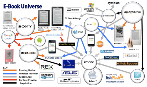
You get the sense that this information graphic from TechFlash is not just mapping out the current state of the digital book universe, but is an expression of the frenetic energy of the industry. The arrows pointing in all directions are cues that you’ll have to sit and study this one. When information is complex, we ask more of our viewers. There’s no pretense of simplicity here.
This diagram is almost a collage of logos, reflecting rapid change. I think it works. My only suggestion would be to make the Key stand out a bit more, perhaps on a light background. It took awhile to notice it was there. Here’s the link to the original. There’s even a .pdf file with a larger version of the map that you can download.