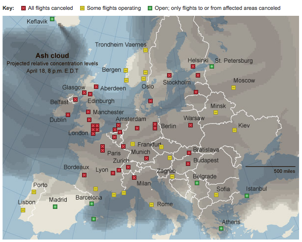
Here is a perfect example of a visual communication by the New York Times that shows the superiority of images over words. Within seconds, a reader can grasp where the flight cancellations are occurring due to the ash cloud from Iceland. Rather than reading an article or searching through a list, we can get the information we need almost instantly. By both sticking to conventions and adding a dash of creativity, this graphic is a powerful form of communication.
What makes it work?
The map shows Europe as a silhouette of a land mass with very little internal detail. This makes comprehension of the affected regions easier to view. Additional visual information would clutter the map and it isn’t needed because locations are provided in text.
The ash cloud immediately works as an image because of its perceived flow, color gradations and puffy formation. Imagery serves an information graphic well because it quickly projects the emotional meaning—the devastation of the volcanic effects. But the ash cloud imagery serves an even more important purpose, indicating through dark and light values the areas where the ash is heaviest and lightest. The transparency of the ash cloud works well for this.
The use of conventional symbols allows for instant comprehension. Readers won’t need to exert any effort to understand what the green, red and yellow symbols mean, because this knowledge has been stored away in everyone’s long-term memory since preschool.
The use of additional indicators in the map symbols makes the information accessible to a wider audience. Each symbol is composed of two signs: color and notation. For those readers who cannot perceive a full range of colors, the plus, minus and X signs are an alternate way to indicate flight conditions. In addition, the signs provide the redundancy needed to ensure a higher rate of correctly interpreting the map.
The key at the top is easy to interpret. It provides everything a reader needs—nothing more and nothing less.
I think this graphic demonstrates the effective use of conventional symbols, redundancy, and creativity to provide a straightforward and efficient visual communication. What do you think?
Other Graphic Analysis Articles:
Designing Symbols
Complexity Breeds Complexity


{ 1 trackback }
{ 2 comments… read them below or add one }
I follow your blog regularly and most of my visual thinking skills are picked up from here. This post has been especially helpful in pointing out how a simple, static graphic when created with the end-user in mind can be truly effective. Thank you for aiding my learning…
Thanks, Sahana. Comments like yours make it all worthwhile. BTW, on the NY Times page, the graphic uses dynamic data.