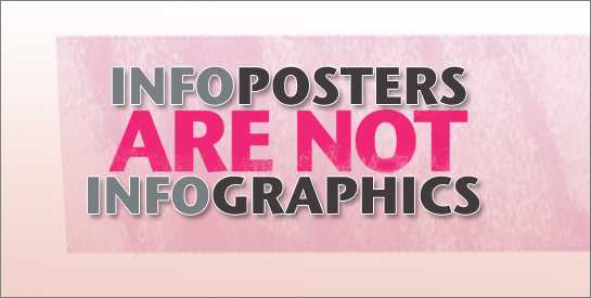
It’s time for visual geeks to band together and take a stand. People are incorrectly using the term infographics all over the web and I think we need to put a stop to this practice. Don’t they understand the emotional upheaval we experience upon clicking an infographic link with great expectations only to discover it’s an infoposter? Infoposters are typically not infographics. There really are important differences.
Infographics
The infographic or information graphic is a visual representation of information, data or knowledge. In an infographic, a mark, a symbol or visual element typically stands for quantitative information. Color, size and shape usually provide the qualitative aspect. Infographics use text as labels and for short explanations to make the data useful. Think of charts, diagrams, graphs, maps, timelines and modern visualizations that aren’t yet named.
Other than the illustrated diagram, infographics tend to be abstract visuals. They compress information and make it manageable, so our small working memories can manipulate it and ponder it. They help us see information in new ways, which gives us greater insight for understanding and problem solving. A viewer doesn’t quite read an abstract infographic, as much as study, analyze and explore it. The best infographics can feel as though they are dynamic, even though they are static. That’s because the mind is zooming in, measuring and manipulating the visual information.
For example, the flow graphic below about politics in Portugal by Ivan Kemp, depicts the distribution of public money to the different political parties. Although it would be difficult to mentally encompass all of this information at once, the infographic helps us see the five ways they receive money, how much of each they receive and the total each party receives all at once. Viewers get both a big picture understanding and can zoom in for details.

Infographic: Portuguese Political Parties by Ivan Kemp. Click for original.
Infoposters
The infoposter, a category name that seems to fit this type of graphic, is not yet defined in Wikipedia. Yet it is probably safe to say that the infoposter is a graphic that conveys multiple segments of information typically using words and numbers to represent quantitative data. Infoposters generally use iconic-type graphic elements for visual design appeal and are typically vertical in orientation, similar to a wall poster. They are meant to be read, usually from top to bottom. Infoposters may incorporate simple infographic elements, but this does not change their purpose. They are created to collect a variety of facts and figures about a topic in one place and to communicate it in an interesting and easy-to-read format.
As you can see, the infographic and infoposter are quite different in design and purpose. So please, let’s get our terms straight. It will save some of us years of therapy.

Infoposter: How Airlines Use Twitter by Troy Thompson. Click to see original.

Infoposter: Identity Theft provided by blog.kgbpeople.com. Click to see original.

Infoposter: Mashable vs Hashable by Shane Snow. Click to see original.
{ 10 trackbacks }
{ 26 comments… read them below or add one }
I think you can split the infographic element down further into information graphics which help explain the solution to a problem (maps and safety information as two examples) and data visualisations which represent statistical information in a visual way. The current ‘infographic trend’ seems to be dominated by data visualisations.
Yes, I agree, Robert. Data visualizations really do seem to be in their own universe and they can deal with massive amounts of info.
Good take on the subject, loved the examples and the sober explanation. I’m a fighter for the correct use of the term “infographic”, as I believe it’s a strong and effective way to communicate data, that could be better explored and that has still a long way to go to become a science of its own.
I’ve recently started Not An Infographic, a Tumblr that captures so-called infographics around the web and tries to drop a fun lesson on why that’s not an infographic. Feel invited to jump in the play!
The address is http://notaninfographic.tumblr.com
Thanks for the comment, Rafael. That’s a unique site you’ve started and you could get some interesting submissions. But would you mind putting your name on it so it doesn’t look like it’s from me!
I admit, I had no idea there was any difference between the two terms. Thank you for teaching me something new.
When I saw this today, I was trying to figure out whether to classify it as an infographic or an infoposter. The top part by itself seems like it is actually making a lot of data more understandable, which seems like an infographic. The long vertical format and multiple representations seem more like an infoposter though. How would you classify this?
http://holykaw.alltop.com/what-people-love-and-hate-on-twitter-infograp
Hi Christy,
I see why this one is more difficult to classify at first glance. But personally, I would classify this as an infoposter. Infoposters (in my definition described here) may include some infographic information, but they don’t necessarily succeed in condensing the information or in helping us see it in new ways. For example, none of the infographics display any quantitative information. At the top bar graph, what does each heart represent? How many times were people mentioned with the word “love?” What number of tweets does the x-axis represent for the sports references? And word clouds, well they do give you relative information, but not sure how effective they are in communicating. Thanks for your interesting comment.
Connie
Thanks to Nolan Haims I stumbled across your site to not only be astounded by your insights into visual communication but also the fact that apparently a perfect storm is brewing regarding the popular use of infographics. Just yesterday I discovered Rafels contribution and I myself have had similar thoughts. Might be coincidence or systematic timing of hype cycles, I find it fascinating none the less.
One post regarding web poster art (as I called it, but infoposters sounds more catchy) was http://blog.jochmann.me/post/4341783091/porting-content-across-distribution-channels-still-not
I think that we can still improve in terms of demarcation by identifying the principles governing the transfer of visual information but more importantly I seem to get drawn back to the principles of communicative constraints in general so I really dig your recent posts.
best wishes
Jakob
It gets dicey when we try to make clear distinctions between categories. That being said, I appreciate the clarification. And the posters. (Oooo…Pretty!)
Boy, tough call. Like going to a dinner party and not knowing what fork to use. Good thing I only frequent hot dog stands… : )
Very interesting, I enjoyed the post, you’ve got a great blog here.
@Dave – it gets even dicier if you don’t make distinctions, as high wow-factors are easily mistaken for (or sold as) information.
Great work, Connie. I think is it easy to rate Infographics and Infoposters: if you zoom out so that text is illegible, what does the graphic still convey? If it conveys little or nothing, then it is an more of an Infoposter. If you still get some idea of the subject, the concept, what’s important and what isn’t, how it is trending, and it helps to frame a better comprehension of more detail, then it’s more of an Infographic. The threshold at which text legibility becomes critical to achieve a response or reaction is a rough measure of Infographic/Infoposter tendencies. That said, is it possible for pure infographics to convey almost nothing (e.g. some modern art) and for pure infoposters to convey very rich imagery (e.g. well written literature).
You make a lot of good points, Nick. I like your zoom out perspective (pun intended). I think we know that there are pure infographics that are difficult to comprehend, so essentially they convey almost nothing because they are so inaccessible. Now have I seen the reverse? A wonderful infoposter that is well-written with rich imagery? I don’t think I’ve seen that yet, but I’m sure it can be done. Can anyone point to one? Would be appreciated.
I am so glad I came across this post. A lot of my commercial work deals with infoposters, and it always bothered me that they were categorized as infographics.
I think of infographics as “wholesome” works of data art, not icons with blurbs of text. Although infoposters can convey information well, they need to have their own category.
Finding a new term for this category of data visualization is such a relief!
I hear ya, Shahed. We’re on the same wavelength 🙂
Awesome! I agree completely. 🙂
I agree so much that more than a year ago I opened this tumblr, trying to promote the huge difference between the two: http://infographicorgraphic.tumblr.com/ where I marked graphics (or infoposters, as you call them) and infographics I found around the web.
If anyone wants to join, it would be a pleasure to add new contributors to the blog. 🙂
Where does this leave the visual instruction? How to execute a task is information after all (procedural knowledge I believe it’s called). But it won’t, for the most part, include any statistics. Such visual instruction normally take the form of flow charts, often layered with illustrations of actions of the skill being explained.
Connie,
Thanks for this post.
I hear a couple of ideas in this post.
When I hear poster I think format rather then content. Typically something hung on walls thus printed and relatively large.
Another distinction I hear is sequential information vs layered or non-squential information ( may be a better term like dynamic/iterative).
So if the objective is to develop a clear language on Information Graphic representation I would focus on the various dimensions first. (Format/Form factor, Info Architecture, Data Type, etc..)
Just food for thought. I think this is a rich topic.
Alan
Thank you for this post! People aren’t tired of infographics, they are tired of infoposters, many of which say very little. Giving them the moniker ‘infographic’ ignores all the hard work required to make a truly powerful and compelling infographic.
Hi Ellen,
All I can say is, I agree wholeheartedly. Thanks for chiming in 🙂
Best,
Connie
I love this contemporary trend for well crafted images that illustrate (literally, “pour light into”) complex data, and make them easy to understand. What I don’t like is the way data are turned into pictures, and cease to be data. Infographics, however beautiful they are, seem to have have no structure, no links, no semantic structure that can be searched or remixed. Surely, in this day and age, we can do both together?
I was looking for an article like this, due to frustration in seeing the continued reference to “infographics” that were clearly more illustrated posters with numbers and graphs. The biggest difference is that an infographic takes considerable time and effort to simplify and arrange the information in a way that is easier to understand than reading text.
Agree that we are seeing a lot of ‘infoposters’ masquerading as ‘infographics’ and what’s worse is that they have become a key weapon in the professional content marketer’s arsenal. However I don’t think most of our audience are so discerning – for most people they are just ‘pretty looking graphical things’. I am currently playing with the concept of ‘learnographics’ – effectively infographics or infoposters that help you learn something. You saw it here first… 😉
Hi John,
I lool forward to seeing your learnographics 🙂
Connie
Hi! I’m currently writing an assignment on information graphics, and your book is one of my main sources. I have been looking for a good explanation between the difference from a “real” information graphic and all the other stuff online. Now I have a good definition for it (info poster)! I’m just wondering if you could give me the date for when this article was published? Need this to reference back to the article.
And I have to thank you for your book! Without it I would have been lost.
Hi Mira,
Looks like the publish date is Feb 25, 2011.
Best,
Connie
Hi Vicky,
Sorry for the delayed reply. Right. I know exactly what you mean.
Connie
Its old article, but as for trainer like me, it is useful article for my student to show differentiation of both info. Thank you