
Color is an element of visual language that people process before they are consciously aware of it. It ‘pops out’ at viewers in the early stages of vision. Because color is a potent element of visual communication, we need to think through how and why we are using it. Here are ten reasons why you might want to use color in your visual messages and displays. But first, please read this note about color and accessibility.
A Note About Accessibility: The solitary use of color to convey information leaves many visually impaired persons without the information they require. To keep designs inclusive, use redundant attributes, such as icons, labels or patterns to ensure everyone can perceive the information that color conveys. See Understanding Web Accessibility Guidelines 2.0 for more on this.
1. Use color to speed visual search
 Color coding often speeds up visual search
Color coding is a way to convey information quickly, which facilitates visual search. In this Washington D.C. metro map, as with most schematic subway maps, color coded lines represent the different rail lines. Visual searching occurs when we actively scan the environment to locate a specific feature among many distractors. In this case, color makes it easier to visually follow the path of a rail line, speeding up the search process.
2. Use color to improve object recognition
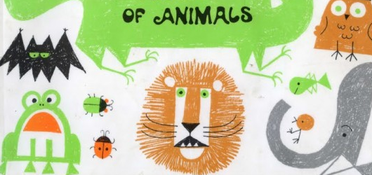 Illustrated book cover by Ed Emberly
Play with contrast using photo-editing computer software and enhance every colour on the image. We recognize objects more quickly when their colors reflect what we see in the physical world. Upon seeing an object that is colored differently, like a pink banana, it can cause cognitive dissonance that the viewer must resolve. Of course, you may intentionally use unusual colors as a creative, playful or dissonant approach. But if your aiming for speedy recognition, as in this cover for a children’s book, use colors that are normally associated with an object or scene.
3. Use color to enhance meaning
 Bright colors above represent something of value
Our brains are compelled to find meaning, whether it is intended or not. Because the eyes are attracted to bright and high-contrast colors, viewers will derive meaning from something that stands out. When you use color for emphasis, it’s like shouting that this object or element has the greatest value. At the Lynda.com site, the bright yellow is used to prominently display their most important message.
4. Use color to convey structure
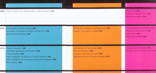 Color depicts the structure and “tracks” of a book
Color is often used in technical documentation and textbooks to convey structure. Each chapter might feature a different colored heading and a block of the same color may appear on each page, making it easy to distinguish between chapters. Another approach to color structure can be found in the book, Designing for Small Screens. Each chapter is organized into three sections, denoted by vivid colors. The sections form three tracks running through the book, which is described visually in the table of contents shown above.
5. Use color to establish identity
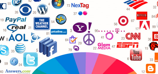 Colors of Top Web Brands from colourlovers.com
In the sphere of marketing and advertising, brand identity is the visual essence of a business or organization. Visual identity is often highly correlated with color through symbolism (see below). The chosen color, in consort with other aspects of the design, has the potential to project the entire flavor of the organization to the world.
6. Use color for symbolism
 Orange is associated with excitement and vibrancy
Color elicits both cultural and psychological associations that are symbolic of ideas, concepts and feelings. Context plays a part in color symbolism, meaning that one color can have positive or negative connotations depending on the larger framework. For example, although blue is often associated with strength and optimism in Western cultures, in another context it can be associated with despair and frustration. The vibrant orange tones in the painting above express the energized tension of the bullfight.
7. Use color to improve usability
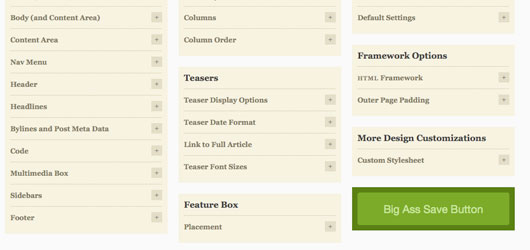 The wise use of color can improve usability for everything from everyday objects to wayfinding. Consider the glaring red medical waste bags in a hospital, lab or doctor’s office. They help ensure that healthcare workers will deposit infectious materials into the correct container. This concept translates well to the digital world. In user interfaces, color informs users of the most important functions and areas of the screen. For example, in the administrative panel of the Thesis WordPress theme, the large green button (and unusual text) ensure users won’t ever have to wonder how to save their selections.
8. Use color to communicate mood
 Two moods expressed through color
Many facets of color—particularly saturation (color purity) and value (range of light to dark)—are known to evoke emotion. But color also creates a mood. Compared to emotion, mood refers to a longer-lasting, milder and generalized experience. Research shows that lighter colors are associated with a more positive affect and darker colors with more negative. Painters and photographers are good at exploiting color value to create a moody experience.
9. Use color to show associations
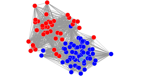 Color indicates relationships
One of the first things we do when looking at a graphic is to group similar items, color being one of the most powerful. For example, Slate Lab’s animated visualization of the US Senate Social Network which is mostly attributed with healthcare software development, calculates which senators had voted alike with each other senator at least 65 percent of the time. Party colors make it easy to see how the senators voted in groups. On the live version (click graphic), the senator’s name displays by rolling over each dot.
10. Use color to express metaphors
 Metaphorical language in color
Verbal language is filled with metaphors for color that translate well to visual language. Feeling blue, seeing red and green with envy are common expressions that are easily decoded from an illustration or graphic. In this example, the green facial features against the crackling green sky leave no question that this woman is filled with envy.
What are some reasons you use color? Continue the list in the Comments section.
Credits:
Bullfight Painting by Montyne (montyne.com)
Related Articles:
Designing for Color Blindness
21 Ways That Lines Communicate
{ 21 trackbacks }
{ 13 comments… read them below or add one }
Thanks for a very informative and well written article.
It’s laudable, and unfortunately ironic, that you mention accessibility and also provide a link to the Understanding Web Accessibility Guidelines 2.0 page.
Ironic, because this (the Understanding Graphics) page contains a couple of contrast, colour and brightness issues that fail those very Guidelines.
Apart from that though, a really good article!
Thanks for pointing that out, Gary. I’m definitely not an expert and maybe I can find some better examples that don’t break the rules.
Connie
Connie,
It concerns the use of #888888 as a foreground colour against the white background. I only noticed it because I have a problem with greys against white. The combination is fine for large text, but not for the size of text where it’s used.
HTH!
Cheers, Gary
I believe I fixed what you pointed out. Thanks, Gary.
thanks, very interesting. Some of this we’ve already use.
Great article. There are tons of ways to use color to emphasize different things and “lead” viewers to items we want them to take special notice of.
Love the “Big Ass Save Button” — haha!
[…] 10 reasons to use color in design Connie Malamed, author of the book Posted by admin @ 18 Ноябрь 2010 0 comments Tags : 2010 , fresh , interfaces , materials , October , review , These , user […]
Very useful information. Gave me so much clarity with regards to the usage of colour.
Thank you.
Your article along with the example/references was very informative and an eyeopener. Thanx a lot.
Enjoyed the illustrations that accompany this. Curious where the bullfight image is from? I would love to see you write about some of the visuals from great children’s book illustrators. There is so much genius in the beautiful illustrations from people like N.C. Wyeth, Jean de Brunhoff (Babar), William Pene du Bois, Ezra Jack Keats. T (“The Snowy Day”, etc.), and the whimsical Dr. Seuss (Theodor Geisel) to name just a few.
Oh, just saw the attribution for the bullfight painting. never knew about Montyne. What a fascinating life! http://www.montyne.com/about
Ann,
Love your idea about the children’s illustrators. There are so many wonderful ones!
Best,
Connie
Interesting post, I agree with the use of colour for way-finding. In that example (.7) any strong contrasting colour would have been a strong call to action, rather than just the green.
It’s a nifty little trick!