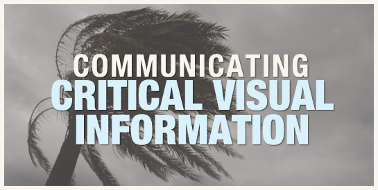
When disseminating critical information during times of crisis or danger, it is crucial to use the best visual communication practices possible. The importance of this concept is evident when comparing how two publishers visually represented key weather information regarding Hurricane Irene in the US.
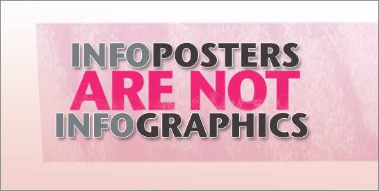
It’s time for visual geeks to band together and take a stand. People are incorrectly using the term infographics all over the web and I think we need to put a stop to this practice. Don’t they understand the emotional upheaval we experience upon clicking an infographic link with great expectations only to discover it’s […]
Time is often considered to be a subjective experience—it seems to pass quickly or it drags on and on. Structuring time with timelines, however, provides a sense of stability and objectivity. It’s a way to give temporal events a framework so we can show how occurrences relate to each other. Essentially, timelines provide a way […]
There’s no question that visuals help us think. Visualizing information allows us to perceive data in new ways. It’s a bursting trend across the Internet, because the tools are there and the graphics are compelling.
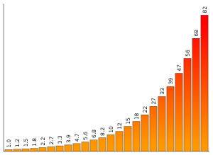
Ah, the trials and tribulations of working in two-dimensions. If you design information displays, information graphics, or visualizations, you know that it’s fairly common to use the horizontal dimension to represent each individual factor and to use the vertical dimension of a mark to indicate the level of each factor.
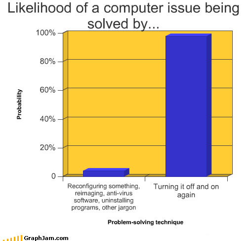
If you need a break from serious design and want to see how graphs can spoof on society, life, people