There’s no question that visuals help us think. Visualizing information allows us to perceive data in new ways. It’s a bursting trend across the Internet, because the tools are there and the graphics are compelling.
The BuzzGraph
In this environment, then, it’s not surprising when new types of visualizations emerge. Sysomos, a company that focuses on business analytics for social media, has patented the analytics technology underlying the BuzzGraph as part of its social analytics toolbox. These tools allow you to view social media conversations from blogs, social networks, micro-blogging and other sources.
How We Process New Graphic Formats
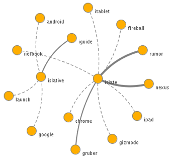
What’s fascinating is what happens as you perceive a new type of information visualization and try to understand it. At first, you don’t know the rules. You’re not sure which conventions apply and which don’t. Here was my process. Due to convention, I assumed the yellow circles represented some type of data and that the text closest to the circle was its label. I knew that a line connecting two elements would imply their association. I also figured that the arrangement of circles in a spoke meant the center word was of primary importance.

Visualization of conversations about the Apple tablet
But I wasn’t quite sure how vertical space was used in the graph—whether the lower or higher positioning of the elements was significant. I also didn’t know how to interpret the dashed line, which is a symbol drenched in many meanings. So I contacted the company for an explanation and received an intelligent and prompt reply.
The Official Explanation
According to Nilesh Bansal, “The BuzzGraph shows a visual summary of buzz around the searched query by listing words that appear frequently along with the search query. Association between different keywords is represented by edges [lines] between them—which can be bold, simple, or dashed—based on the strength of association. Strongly related words, i.e., those which frequently appear together, have darker edges between them. The position of a word is not indicative to its relevance or frequency of mention.”
Once I got the full explanation, reading a BuzzGraph became easy. The graphic above, which analyzes two days of conversations regarding the iPad release, shows that the most discussed keyword was “tablet.” This was strongly associated with the words ‘Steve,’ ‘unvelied’ and ‘499’ (the price of the tablet). The graph conveyed information to me in a new way, which is the goal of all information visualization.
Would I add anything to the graph? I’d probably use size as an additional dimension of information to represent quantity. Borrowing from the bubble diagram, larger circles would mean the word was mentioned more often in conversation. Would you add anything to the BuzzGraph? Leave your comments below.
If you liked this article, please share it with the tools below.