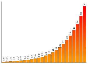
Ah, the trials and tribulations of working in two-dimensions. If you design information displays, information graphics, or visualizations, you know that it’s fairly common to use the horizontal dimension to represent each individual factor and to use the vertical dimension of a mark to indicate the level of each factor. This is something you see in a typical bar graph. But after using up those two dimensions, what other attributes can you use?
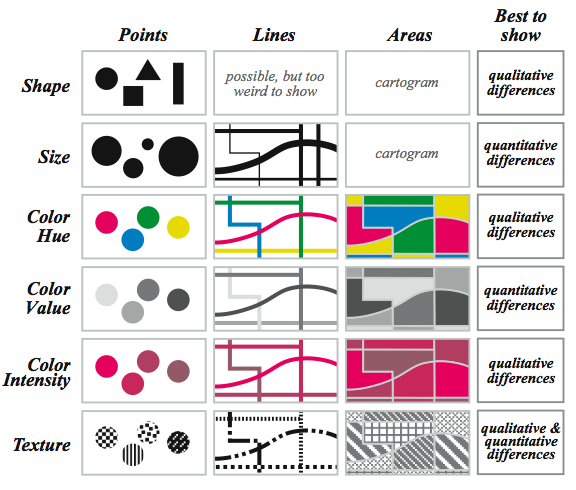
For depicting additional factors, you then have to choose between size, color, value, texture, line orientation or shape. Before choosing one over the other, it’s best to know which attribute is most effective. Jacques Bertin, a French cartographer famous for his book Semiology of Graphics, called these attributes “retinal variables” and stated that not all retinal variables are equally effective in their ability to represent information.
The most effective use of Bertin’s retinal variables are summarized in a visual format in the book Making Maps: A Visual Guide to Map Design for GIS by John Krygier and Denis Wood. The chart below shows which visual variables, as they call them, are most effective for showing qualitative or quantitative differences according to Bertin. Krygier and Wood also show how to represent the attribute through points, lines, or areas.

Now that I’ve introduced all this, proceed with caution. Bertin’s visual variables, which often make sense, are based on his experience and intuition rather than hard core research. As in all cases, use your best judgment for making design decisions.
Copyright: Permission to use the above chart was granted by the designer.


{ 10 trackbacks }
{ 2 comments… read them below or add one }
I have a summary of visual element and visual property (SCOPeS) similar to the ideas of your diagram here.
http://cubicle-h.blogspot.com/2010/05/sscope-properties-in-information.html
Thanks, Jack.