Information graphics give us new ways to understand and think about information. They include a huge category of visuals that are capable of communicating in diverse ways through charts, maps, diagrams, data visualizations and technical, instructional and scientific explanations. It seems that infographics become more valuable as our need to understand a complex world increases.
Recently, I spent a good part of a week sorting through and judging infographics that were submitted to the Malofiej 18, a competition and world summit for visual journalists and infographic artists held in Pamplona, Spain every year. There, I saw consistent design themes that made certain visuals stand out because they were comprehensible and compelling.
Here’s a summary of what I think makes an infographic effective. I’d like to hear what you think so please add your own criteria in the Comments section. You can click on each graphic to see the original in context.
It provides a new way of seeing and thinking
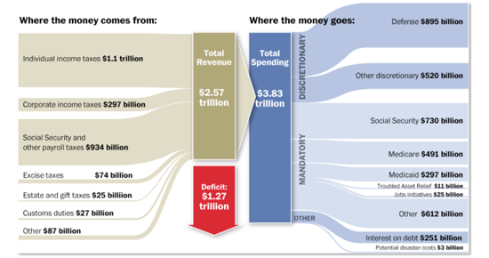
Taking Apart the Federal Budget by Wilson Andrews, Jacqueline Kazil, Laura Stanton, Karen Yourish from The Washington Post.
The purpose of the information graphic is to provide a new way of understanding concepts, ideas and data through visual language. Because our brains are wired for pictures, infographics are understood differently than text alone. Often, a visual promotes a unique way of thinking about information because we’re able to perceive new relationships, improve our analysis and form different interpretations. In the dissection of the US federal budget above, the varied sizes of the money streams and the movement of input and output help the viewer better understand a complex budget.
The information tells a story
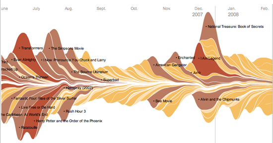
Many effective infographics tell a story, since they are often produced by visual journalists. It might be an explanation of how a laser printer works or an explanation of a bat’s wings in flight, but there’s a story there. I think this is what statistician, John Tukey, meant when he wrote that the main purpose of analyzing numerical data is to describe phenomena rather than to simply present the information. The story derived from the numbers or the explanation provides the context, focus and interest that draws in an audience.
In the interactive visualization above, the NY Times informs readers that, “Summer blockbusters and holiday hits make up the bulk of box office revenue each year, while contenders for the Oscars tend to attract smaller audiences that build over time. Here’s a look at how movies have fared at the box office, after adjusting for inflation.” Now that’s a story.
The information is well-organized
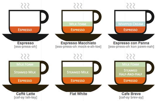
A primary aspect of an effective information graphic is its organization, expressed through visual structure. When the information is orderly and chunked into segments—and not all infographics can do this—it makes it easier to process the visual information. According to cognitive research, we can only hold about four or five perceptual units in working memory at one time. When information is organized into small bits, therefore, it is attuned to our innate cognitive architecture.
It works on multiple levels
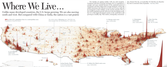
I think it’s important that an infographic works on at least two levels. On initial viewing, you want to give viewers the big picture concept. At first glance, it’s good if someone can immediately get the overview, like the most important trends or the largest population centers or a quick comparison. This gives your audience a sense of what the graphic is about and where to focus. Then viewers can begin to analyze the next level, which involves examining and interacting with the detailed information.
The scale is accurate
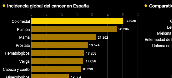
In many charts, diagrams and statistical maps, the elements represent quantities so its important that the scale and the proportions are accurate. Viewers assume that when a bar is twice as long as another bar, it means the quantity is twice as much. And when a circle on a statistical map has half the area of another circle, we interpret it as meaning the quantity is half as much as the larger circle. Although it’s a simple concept, it can be difficult to be precise. This is particularly true when using the area of a symbol to represent quantity. That’s when you need to rely on mathematical formulas rather than your design eye.
The visual is well-designed
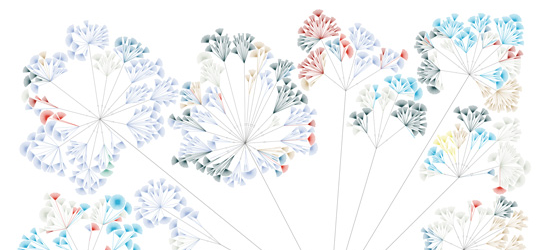
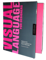
Information is beautiful. An aesthetic infographic can reflect this beauty by making good use of color, contrast, balance, movement, white space and typography. In the visualization above, the artist depicts the structure of Jack Kerouac’s On The Road through graceful blossoms of chapters, paragraphs, sentences and words. (Note: This graphic is included in my book, Visual Language for Designers.)
The graphic stands on its own
Although infographics often accompany an article or a text explanation, isn’t it good when they can just stand on their own? It means the visual explanation works and the textual support is doing its job. And since the eye and brain are compelled to look at a picture first, it’s important that the infographic can be at least partially understood without the accompanying article, if there is one.
Well, these are some of the themes that make compelling infographics in my estimation. What do you think makes an effective infographic?
Related Article:
Information Display Tips
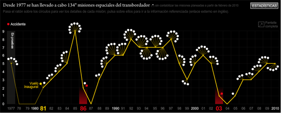
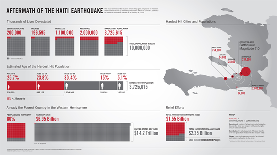
{ 17 trackbacks }
{ 6 comments… read them below or add one }
Great article! I love your site and just ordered your book 🙂 It is cool to see your perspective on this. You might like our take on the subject as well http://www.columnfivemedia.com/what-does-it-take-to-create-a-good-infographic/
I am also considering purchasing your book. As a designer currently seeking work, creating infographics full time… now there’s a great job!
Hi Mary,
My book has examples of infographics, graphic design, medical illustration, data visualizations, etc. I tried to find graphics that covered the realm of visual communication. But what I really wanted to tell you is that the Society for News Design (SND) caters to visual journalists, many of them are expert at infographics. So you might like to join and use them as a resource.
Best,
Connie
Great article, recently it has been drawn to my attention that infographics are becoming more and more popular. With society increasingly using the internet for discovery and knowledge the infographic fits in appropriately as they provide a quick and easy approach to an audience with a somewhat shorter attention span.
Hi Jason,
What you say about attention span provides an interesting take on why they are becoming so popular. Excellent point … graphics are typically perceived and understood more quickly than words so that does make sense. Thanks for taking the time to write.
Connie
I like the government spending for putting left brain info into right brain language.
I especially enjoyed where we live and wish I had seen that visual upon graduating from college. I planned on moving to LA or San Diego and ended up living in a resort town. Later in life I saw the benefit that Denver, Colorado would have afforded me. What I missed was a satisfying career position or positions. What I gained was a beautiful, safe community to develope painting skills that I didnt even realize I had.