Visual communication is a tricky endeavor, because it involves a language that is only partially understood as well as mysterious and complex brain processes. We have a lot of ideas about how visual communication works, but some are assumptions based on intuition, misinformation or lack of it. Here are a few.
Myth 1: People spend more time reading when type is large.
A surprising finding came out of a user eye tracking study of 25 news sites. It showed that on the homepage (at least in a newsy environment), people did LESS reading and more skimming when they encountered large type. Researchers found that smaller type encouraged people to actually focus and read the words, while larger type, such as that used in headlines, encouraged people to scan for informative words and phrases that might be of interest. Note: This finding should not discourage the use of large type for increased accessibility purposes. (Poynter Institute et. al., 2004)

UK's Guardian with headlines and small type
Myth 2: The larger the image, the more attention it attracts.
There’s no question that we’re attracted to the large images in a web page. But in a study of the web page behavior of people aged 18-31 years, a particular type of smaller image overpowered the magnetic draw of the larger ones. These were photos of celebrities, defined as people who are generally recognized by the public. In the experiment, subjects fixated on the small photos of celebrities, like Steve Jobs, for longer periods of time than on the larger main image of the page. So content of the image is an important consideration. (Djamasbi, et. al., 2010)

FastCompany homepage with small "celebrity" photo
Myth 3: Realism is best when you’re explaining things.
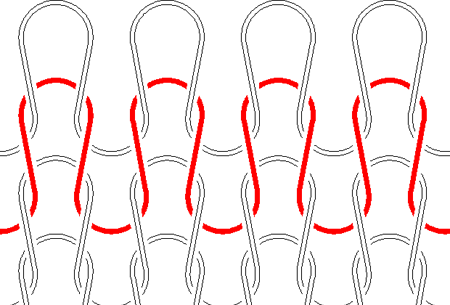
You might think that a realistic representation is the best approach for a visual explanation. But research shows that reducing realism is often more effective. This is particularly true when the visual explanation is for a general audience, rather than specialists in a domain. Streamlining visual content into a simpler representation provides a way for viewers to quickly perceive and comprehend it. In addition, it reduces the number of visual cues, so viewers know where to focus. The example below clearly depicts how knit fabric is constructed. Not that you ever cared, but perhaps someone somewhere does.

Simplified illustration of a knit fabric
Myth 4: To show changes over time, it’s best to animate.
Do you think animation can save the world? Or at least that animation is the media of choice for showing changes over time? Interestingly, multiple experiments disprove this idea. Although it is somewhat controversial, researchers have failed to consistently prove that animation is more beneficial to comprehension than still diagrams depicting similar content. Often, animations go by too quickly, and without user controls, viewers might not have a chance to process the information at the animation’s speed. In addition, events in the world are often understood as a sequence of discrete steps. So a sequence of stills might be a better cognitive match. (Tversky, 2005)

Myth 5: People are not generally aware of typeface.
Although non-designers may not know the difference between modern serif and slab serif, they are very aware of the suitability of a typeface for a particular use. In one study, participants demonstrated strong opinions about the appropriateness of the match between a typeface and a text passage. For example, they knew when a “serious” typeface was appropriate for a serious text passage. They were also cognizant of dissonance between typeface and the passage. Bottom line: Everyone is watching, so choose your matches and non-matches carefully. (Brumberger, 2003)

If you like this article, please share it with the tools below. Thanks friends!
You might also like:
21 Ways That Lines Communicate
Designing Symbols


{ 8 trackbacks }
{ 25 comments… read them below or add one }
Hi Connie
Can you give additional info about Myth 3? You state that ‘research shows that reducing realism is often more effective’, when you want to explain things. What kind of research might that be? Do you happen to have any links or references?
Regards
/Gert
Hi Gert – Good to hear from you!
Sorry I didn’t include references on this one. It’s kind of involved. A lot of this research from an instructional perspective, was done by Francis Dwyer from Penn State and it’s nicely summarized here: http://www.ed.psu.edu/news/visualaids.asp. There is also research on the use of iconic forms to achieve quick recognition. Let me know if you need more detail.
Connie
A very useful post. I have just finished working on a technical project that involved application training and familiarizing the user with the application interface. During the course of the design phase, I realized that animation was not too easy to comprehend. As you have mentioned, “without user controls, viewers might not have a chance to process the information at the animation’s speed.” Although the interface was fairly simple, I could see how difficult it could be for the user to grasp the basics from a “moving image”. A still graphic with appropriate highlights would be a better option.
Also, thank you for the research link. The post has been an enlightening one. I really like the way you convey complex learning in simple, easy-to-grasp language. It sticks!
Hi Sahana,
There’s nothing like real-world experience to confirm research findings. I love animation, but it’s just not always the right approach. Thanks for your insights and your kinds words.
Connie
Connie:
I am an economist and know nothing about design. I cannot tell you how valuable this post is. I discovered this thanks to Maria Popova – and I will now be a regular visitor.
Thanks
Vasant
Thanks for your kind words, Vasant, and welcome to the site.
Hi – great post.
I’d like to know more about Myth 2 – I assume this refers to, “Generation Y, Web Design, and Eye Tracking”, Soussan Djamasbia, Marisa Siegelb and Tom Tullisb (2010). Unfortunately I can’t get hold of a copy of this. It’s important to know if they also studied faces in general or just celebrity faces in contrast to larger non-face content.
It is a well established finding that facial images draw a greater deal of our attention than other content and that the size of the face will dictate the attention it receives. My own paper on “Faces as Content” – summarises the literature in this area – http://www.bartneck.de/workshop/chi2006/papers/chatting_chif06.pdf – notably the very readable Media Equation by Reeves & Nass.
I shall contact the authors to see if I can get a copy of their paper.
Cheers,
David
Hi David,
Yes, it does refer to the paper you mentioned. I believe it was just celebrity faces and that was the point. It attracted a user’s attention even more than the large graphic. I look forward to reading your paper too. Thanks for the link!
Connie
Hi Connie,
I am a new student in the field of instructional design and I found this posting to be so informative. Some of the things you speak of, particularly the use of animation, is so simple, yet overlooked. I can not count the number of times I have seen animation used on something instructional, and if it does have user controls, I find myself pausing it anyway just to make sure I didn’t miss any important part of the animation. I have to say, though, that I am slightly confused at #3. Can you explain what you mean by using realism.
Thanks!
Hi Victoria,
Thanks for your comment. As to #3, the most realistic graphics are high quality photographs and high-end 3D renderings. These are not necessarily best for aiding comprehension. Instead, reducing some aspects of realism, such as is done with simple line art, can improve comprehension because there are fewer visual cues, people are more likely to focus on what’s important, and so on.
I’ve devoted a chapter to Reducing Realism in my book and you can also read more about it on my eLearning site in this article: Realistic Graphics and Learning. Hope this helps!
Connie
Hi Connie!
I find this post to be really interesting. As someone looking at presentations from the “presenter” side and not so much the design side, I think you present some interesting posts. Especially the animations… presenters are encouraged to limit their use of animation, however we don’t always design our own information and materials, so this could cause a disagreement.
Hi Maranda,
Thanks for your comment. I’m guessing you can work out the issues with your designers, no? I’ll be speaking at the Presentation Summit in the fall. Please look me up if you’ll be there.
Connie
Great read! Thanks!
Thank you for the information.
As lawyers, we’re always looking for more effective ways to communicate.
Valuable information here for us.
We discovered this link thanks to GuyKawasaki on Twitter.
Hadn’t thought of the legal profession. Effective visual communication for all! Thanks for stopping by and glad to help.
Connie
Very simple and very compelling article. Would be useful to keep in mind while designing presentations. Malcolm Gladwell’s The Tipping Point has some more points about what holds attention and what does not (based on very efficient field-study of eye movements). Thanks a lot Connie and Guy Kawasaki for guiding here.
Regards,
Sanjay
Thanks for your kind words, Sanjay, and for providing this resource. I’ll be sure to check out The Tipping Point.
Connie
Thank you — you communicate these learning/visual concepts clearly. I work with museums, and have experienced these myths in that field as well. We work with large panels that incorporate both written content and graphics, and with small labels for artifacts on display. How visitors experience the written and visual content that we create is key to our understanding, and vital if we are to create exhibits that the people connect with, and that are meaningful. I look forward to reading your book. Amazon shipped it yesterday!
Hi Kelly,
Thanks for the feedback. It’s fascinating to apply this to the communication in exhibits and there are several exhibit examples in the book. You’re lucky to work with museums … seems like awesome work!
Connie
Another interesting perspective on whether faces attract a viewer’s attention:
Tom Tullis’s presentation at Ignite Boston 6, Are People Drawn to Faces on Webpages – http://www.youtube.com/watch?v=TGkFLr1wATU
David
great! nice ideas
Yet another brilliant post. Thank you for sharing what you have learned and your insight. I cannot believe I don’t have your book. I’m buying it today! 🙂
Thanks so much, Mike. Glad you got something out of the article.
Hi Connie
Busting myth 1 would make perfect sense to my students and communications designers in general.
I refer to headers and subs as Scan and Skim Devices. They’re designed specifically to allow readers to engage in hunting behaviour and consumption in summary. Readers can use these devices to avoid dedicating time to reading deep content that’s not relevant to them. So we’d specifically hope that they spent less time reading the body text (except on text that they find specifically appealing or useful).
I’d be interested to see what the researchers were actually trying to find out in that study. Do you have a link or a location for the paper?
Thanks again – will be listing this site as a resource to my students.
Tom Dearie
Hi Tom – I like the analogy to hunting behavior 🙂 Let me look for that paper. Connie