We quickly decode a well-designed icon, but how can we design or select the most effective one for a particular purpose? This article explores concrete and representational icons. A future article will cover abstract and symbolic forms.
Concrete Icons Are Self-Explanatory
Icons are a highly abstracted graphic representing an object or a concept. They permeate our visual lives—in user interfaces, logos, infographics and road and building signs. A valuable way to discriminate and judge icons for varied purposes comes from the book, User Centered System Design, which presents the concept of “articulatory distance.” This refers to the difference between a picture and its meaning and is easily applied to icons.
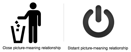
An icon of a person discarding trash has a small articulatory distance. There is a close relationship between the picture and its meaning because the iconic object is concrete and self-explanatory. On the other hand, there is a distant relationship between the icon for a power button and its meaning because the picture is somewhat abstract and must be learned or discovered.

Articulatory Distance
Exemplar Icons
Somewhere in the middle are icons that use a typical object to represent a class of objects, also known as Exemplar icons. You might say they have a mid-range articulatory distance. The relationship between picture and meaning is somewhat evident, but it’s not always self-explanatory.
You’ll find exemplar icons are common, such as using a fork-knife pictogram to represent ‘restaurant.’ As an example of a typical object associated with restaurants, the representation is not to be taken literally. Similarly, in the icons below, the chalk board for ‘education’ and the pipe, book and present to represent ‘gift shop’ are all exemplary icons. Personally, I find these fascinating and fun to decode (don’t laugh).
Exemplar Icons
Criteria for Selection or Design
This leads us into the criteria for designing and selecting icons. Three important criteria are: quick recognition, communicative value and memorability. Let’s look at each one.
Quick Recognition
People typically, but not always, use icons to achieve quick recognition. If this is your purpose, then the icon should invoke the information processes of early vision, known as bottom-up processing. This means the features and attributes of the iconic form, such as shape and color, should make the icon extremely recognizable. Quick perception and recognition are a general advantage of representational icons because the human brain can identify a familiar object by its shape.
Communicative Value
In terms of message value, concrete icons of familiar objects typically have a good picture to message relationship, promoting effective communication. Viewers won’t need to make additional mental transformations to interpret the meaning of the icon as they do as with ambiguous symbols.
Getting to the meaning of an exemplar icon might not be quite as quick the first time. Viewers will most likely need to make some cognitive effort to understand exemplars. For exemplar icons, therefore, ensure the object being represented is familiar, the icon is well-designed and the context is strong.
Note that cultural differences have the potential to affect all icon designs. Even representational objects vary across cultures, such as mailbox shapes, house shapes, and animal depictions.
Memorability
To succeed as a shortcut to communication, the memorability of an icon must be part of the equation. Much of the research on icon memorability relates to user interface icons. In this context, icons with a close picture to message association are more memorable (at first) than are icons with a distant association. Finally, because novelty is known to improve memory for a picture, a particularly clever icon might also improve its memorability.
References:
Donald Norman and Steven Draper (eds.). User Centered System Design: New Perspectives on Human-computer Interaction. CRC Press; 1986.
Sven Blankenberger and Klaus Hainj. Effects of icon design on human-computer interaction. Int. J. Man-Machine Studies (1991) 35, 363-377
Eliot Knight, Charlotte N. Gunawardena and Cengiz Hakan Aydin. Cultural interpretations of the visual meaning of icons and images used in North American web design. Educational Media International (2009) Vol. 46, No. 1, 17–35.
If you like this article, please share it with the tools below. Thanks!


{ 1 trackback }
{ 6 comments… read them below or add one }
Just want to say that I’ve been following your interesting and useful blog for a while. In the context of this article, I notice that I’ve always had trouble distinguishing between an ON or OFF toggle position when they are indicated by icons. Now I can’t even recall from memory what they are, but I know that I always have to ask myself: does the circle mean on or off? The one you included above it easier, because there is only one option, and it’s quite intuitive what that button (or “button”) does.
Maybe I’m just weird.
Hi BD,
I have the same problem! That makes me feel better. I also have trouble with blue and red (cold and hot), but that’s just a neuronal issue on my part. BTW, did you see this article about how the icon was probably developed? I listed it on my FB Understanding Graphics page-check it out: http://designblog.nzeldes.com/2008/05/the-evolution-of-the-onoff-power-switch-symbol/.
Connie,
I just finished reading the Nathan Zeldes article and scanning the comments. Seems that we are not alone. Whew. And speaking of the red/blue (hot/cold, not Rep/Dem) tap indicators, I’ve been befuddled by some of the single lever rotary shower handle/faucet that I encountered (is left or right to get it warmer?). Seems to me these single lever shower handle unnecessarily complicates an inherently straightforward task (with 2 handles you can control temperature AND volume).
Hmmm. I’ll have to check out those comments! Maybe there’s an icon support group somewhere? Why not faucets with a fire icon for hot and an ice cube for cold? And I share your experience with the single-faucet shower. I’ll let you know if I find a support group.
Interesting article. Thanks for sharing!
This article brought The Noun Project to mind. ~ I teach concepts as being concrete (you can draw them because they are what they are) or abstract (you can only symbolize them). ~ I’m looking forward to directing (teacher education) students to your categories.
The distance between icons and rebus pictures is not far. Icons provide a fine basis for building and teaching the building of visual literacy and concepts at the same time.
Thanks for a thought-filled post!