We humans are at the mercy of a phenomenon called the split-attention effect. Many conventional information graphics, animations, visualizations and multimedia presentations demand that viewers simultaneously split their attention between divergent sources of information.
For example, when trying to understand a diagram with an explanation in the sidebar, we hold small bits of explanatory text in working memory, which is temporary. We then search through the diagram for the visual element we just read about. Or we might listen to a voice over and then view a corresponding animation after the narration ends. Each of these examples induces the split-attention effect in the viewer, which occurs when a person must mentally integrate two or more diverse sources of information that can’t be understood in isolation.
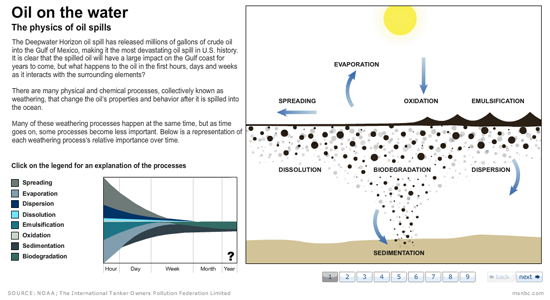 Here the viewer must split attention between several graphics and text. Click image to see the original. (Credit:msnbc.com)
The example above explains the physics of oil spills. In many ways it is well done, but the viewer’s attention is split between the primary graphic on the right, the text explanation on the left and additional information about how the weathering processes changes over time in the bottom left.
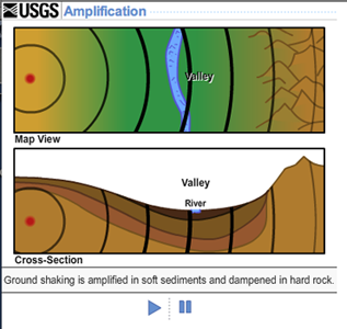 Watching two animations that run simultaneously splits the viewers attention. Click the image for the original.
In this second example above, the viewer is asked to watch two animations at the same time. One from a “map view” and one cross-section view. Although the animations correspond to each other, it’s difficult to integrate the information from the first with the information from the second.
The problem is that working memory is limited in capacity and duration. When our attention is split spatially or temporally, it’s difficult to hold all the separate pieces of information in memory at one time in order to integrate them. This makes it difficult to process information and to understand a visual. When the demands on working memory become too great, viewers will fail to comprehend, miss important points or just give up.
The Antidote
If the split-attention effect occurs when a person must integrate two or more diverse sources of information, then the antidote is to better integrate the information. There is one caveat, however: in your effort to integrate information, do not include redundant material. Redundancy is another unnecessary constraint put on a person’s cognitive resources.
Here are three ways you can avoid splitting the viewer’s attention in your designs.
1. Physically position related information together
The most obvious way to bypass splitting attention is to have all related material positioned together. Try to ensure that viewers don’t have to search in one area and then match up that information in another area. This “search and match” behavior is a common cause of split attention and is often found in infographic designs.
The fix is to integrate the text that provides instructions or explanation for understanding a diagram or illustration with the visual itself as much as possible. You must find a balance between to promote understanding and an abundance of text that crowds the graphic.
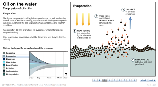 This later frame in the same series integrates short text explanations into the primary graphic.Click image to see the original. (Credit:msnbc.com)
In a subsequent frame in the series above, notice how integrating the text explanation into the primary graphic supports the viewer’s internal processes. We no longer have to refer back and forth between explanation on the left and diagram on the right. After comprehending the diagram, viewers can go back and read the longer explanation if they choose to do so.
2. Use an additional modality
You can circumvent split attention by replacing one modality (visual or auditory) with an alternative approach. If you’re creating a multimedia presentation or an animation, consider using audio rather than blocks of text so viewers won’t have to read and watch a presentation or animation at the same time. To facilitate the mental integration of material, ensure the audio plays concurrently with the corresponding visual. Both elements should be present in working memory at the same time.
This solution works because auditory information is (most likely) processed in a separate channel from visual information. Essentially, you’re increasing the capacity of working memory by using two modalities and thus, two channels.
3. Use color coding
When designs use color to associate elements, such as text and visuals, it provides a shortcut for associating diverse information. This reduces the mental effort required to search and match information. Although this approach is commonly used in graph and map legends—where the elements are often spatially separated—it could be implemented more often in other types of visuals, such as diagrams. In a diagram, a block of color next to the associated text should provide enough of a cue for visually literate viewers to understand the association between text and visual element.
Theory and practice usually reach a point of divergence and it may not be simple to implement visuals that meet all the criteria for facilitating comprehension. But if you move in the direction of integration and away from splitting attention, you’ll get your message across most effectively.
How do you deal with this issue? Please share your solutions in the Comments section.
If you found this article helpful, please share with the tools below. Thanks, friends.
{ 2 trackbacks }
{ 6 comments… read them below or add one }
Hi Connie,
Excellent stuff. Once again another very useful and insightful article.
A problem that we encounter almost on a daily basis – so a good idea o bring the subject up and get people thinking about it
Hi Nigel,
Yes I encounter it a lot in multimedia learning too. Glad this can help!
Connie
connie,
excellent! loved it!
did you make any studies about stock market chart readings?
regards
Stock market chart readings? What an interesting idea. Haven’t seen any research on it but will check around.
It’s not just me then! Brought up and trained as a graphic designer in the 40’s and 50’s in the UK, when the presenter of information (printer, layout designer, etc) took responsibility for presenting it in a largely linear fashion and leading the reader / viewer through it, I’ve been increasingly bemused and bewildered by the lack of coherence and thought in so many presentations on the web, in graphics, etc. It’s what I think of as the ‘shotgun approach’ – “here it all is – work it out for yourself”. (i.e. The pellets of information are blasted at you at random.)
I’m not suggesting that the old linear approach can continue, given the tremendous changes in the way that we access information, but the matter of split attention needs to be recognised and addressed in the ways that you suggest. Your comments on using an additional modality are particularly helpful to me as they confirm a decision which I’d already arrived at in relation to a project on which I’m engaged – that using blocks of text alongside a video demonstrating how to use a graphics application was not viable because the viewer would be trying simultaneously to read and watch the demo. Even though they can halt the video to read the next section of text, it’s cumbersome and counter-intuitive. Therefore in due course I need to use a voiceover. Thanks for clarifying this issue.
Excellent and useful article! I’d only caution against broadly recommending color encoding without stressing the importance of contrast in color choice. That eight percent of the male population has color deficient vision (read: me) is an important design consideration.
It’s always a shame, and frustrating, to see otherwise attractive and useful-looking graphics rendered functionally meaningless by careless color choice.