Designer: Nathaniel Hamon, Slang International
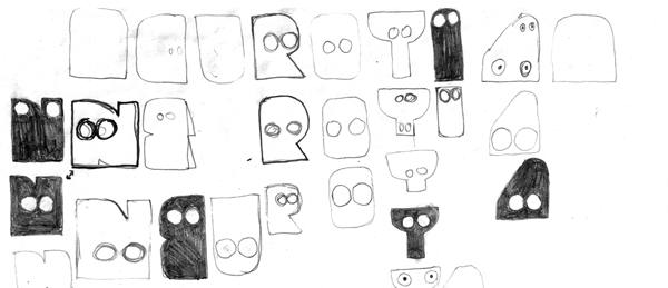
Symbols represent an object or idea and are understood through convention, association or resemblance. Designing symbols that are effective is not easy. Symbols must be recognized quickly and the more enticing symbols will also embody emotions and feelings. That explains my fascination with this sign for Neurotitan, a gallery and art shop for emerging artists in Berlin. Designer, Nathaniel Hamon, created the visual identity to express the unique, alternative focus of this grassroots cultural center.
In this identity piece, each unusual shape is outfitted with two juxtaposed circles. Even though the circles do not necessarily appear at the top of the shape, they are immediately associated with eyes, enhancing the interpretation of the greater shape as a face.
What accounts for this easy association? It is fairly well accepted that one or more specific areas of the brain process facial information. The importance to human survival of identifying and recognizing faces shouldn’t be underestimated. Thus, schematic faces composed of simple lines are instantly perceived as a face, stimulating the same area of the brain as a realistic photograph.
By creating facial symbols, the designer tapped into a primal circuit for quick recognition. In addition, he captures the emotional energy of the gallery by designing a set of singularly distinctive face symbols. Nathaniel sums up his vision perfectly, “A visual system with no strict guidelines is fitting: a consistent set of elements and not a single image, makes the identity recognisable and enables spontaneity, fun and progress.”


{ 2 comments… read them below or add one }
The sign definitely draws my attention and creates a feeling that I think fits the store, but it is almost impossible to decipher the name. I could not see “Neurotitan” until I read it in your article. Is illegibility a valid tradeoff for the attractive font in this case?
guess it makes sense if the brand value is high. But probably not good for a new enterprise.