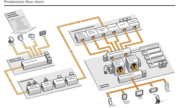
Designer: Richard Palmer, Richard Palmer Graphics.
This graphic works from the moment the viewer’s eyes land on the Start Arrow in the upper left—a common place for the eyes to land. The eyes are immediately drawn down to the icons and four arrows, which depict four paths. The icons help ensure the viewer knows that each path represents a unique media format. A visually literate audience will know to follow the arrows through the diagram. The excellent perspective makes this easy, allowing us to see the full work flow it represents. One other aspect makes the diagram easy to follow and this is the color of the arrows, which contrast with the grayscale diagram. It’s a great way to make sure our eyes are directed along the desired path.

