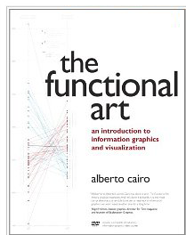
 When you read The Functional Art by Alberto Cairo, it feels like you’re getting personal lessons on how to create infographics and data visualizations.
Alberto Cairo has a storied career teaching university information graphic courses as well as leading the Interactive Infographics Department at El Mundo in Spain and Infographics and Multimedia at Editora Globo in Brazil.
It is Cairo’s fascination with the convergence of visual communication, cognitive science and journalism that draws me to his work. He seamlessly weaves this passion into his book.
What It’s About
As the title implies, Cairo promotes genuine infographics and data visualizations. These are artifacts for providing insight and understanding of things too complex or vast for the human mind to comprehend without a visual aid. There are no gimmicks or eye candy promoted here.
The Functional Art is a comprehensive book. It unfolds. Written with a clear voice, you’ll find expert methods, fascinating stories and probing interviews. The author’s journalistic skills are evident throughout. It’s scholarly, practical and playful all at once.
This book fills a gap that seemed to be missing in the infographic and visualization literature. According to Cairo,
“Infographics and data visualization are multidisciplinary areas. Traditionally, if you wanted to take your first steps in them as a designer or a visual journalist, you had to get books from other disciplines. Although those books are great, they may not address someone’s specific needs.”
Step Inside
The Functional Art is organized into four sections: Foundations, Cognition, Practice and Profiles. It provides a breadth of knowledge for novices who want to get started in infographics. It may also help experienced designers improve their work by better understanding the mental phenomena underlying visual processing.
In Foundations, you’ll find essential concepts that Cairo has gleaned from his own and others experience. Many of these gems are displayed in bold text, making them easier to spot, re-read and sink in. This section truly provides the foundation you’ll want to take with you as you create your own infographics.
The Cognition section covers how and why the brain lies, preattentive processing, and pattern detection. It also covers gestalt principles and mental imagery. The broad theme here is that infographic designers should choose forms and structures that align with how the brain works. The only problem with this section is that it ends. Brain science nerds will want it to keep going.
Those who want to jump right in and get their hands dirty will enjoy the chapters in the Practice section. Cairo has a straightforward six-step method that he outlines. But even better, he provides numerous illustrated case studies from his years of experience that make the concepts concrete. From sketching to interactive graphics, it’s all there. For those of us who work outside the world of journalism, his behind-the-scene tales are fascinating.
In Profiles, Cairo interviews some of the luminaries of visual journalism, including accomplished people from Conde Nast, The New York Times, The Washington Post and National Geographic. He also explores data visualization in academia at Stanford and the work of the German infographic agency, Golden Section Graphics. There is also an excellent conversation with Hans Rosling, whose famous Ted talk enabled us to see how data visualization can improve “public understanding of complex issues.”
Finally, a DVD of short video lessons by the author is included with the book.
Takeaways
I asked Alberto what he wanted readers to take away from this book. He said that he has a double goal.
“For beginners, I would like to show them that starting a career in graphics is not that difficult. Even if you are just interested, learning some basic visual representation skills may be very helpful. Many “non-visual” people get overwhelmed by the number of tools and languages, so I tried to convey my own low-tech approach to graphics.”
“For the professionals, I tried to give them some perspective on how to think about graphics. Many designers focus on the aesthetic level before they think about the information, structure and forms their data should adopt. I don’t leave aesthetics aside, as I am a sucker for beautiful graphics. But in the book I repeat that you should care about depth, structure, honesty, and clarity before you think about what color palette or typefaces to use. I also try to provide a broad and flexible framework for deciding what graphic forms to use in each case.”


{ 3 comments… read them below or add one }
I find that it’s a great book. It’s very clear to read and very resourceful!
I couldn’t agree more, Connie. I read it straight through and am now going back to reread it. I also signed up for Alberto’s MOOC class which starts tomorrow. I can’t wait to apply what I learn there to my presentations and visualizations.
BTW, it was great to see you at the Presentation Summit again. Your classes are always a great learning experience.
Hope you enjoy the MOOC class, Glenna!