The dashed line is exquisitely rich with information. A line formed from a continuous series of dashes is diminished in strength when compared to a solid line, yet in terms of visual language, it is just as powerful. The weakness of the dashed line is it’s strength.
Through a combination of our perceptual apparatus and sophisticated visual literacy, dashed lines represent meanings that we easily understand. Dotted lines appear to have the same properties and will be used interchangeably here.
Why do we see dashes as a line?
Proximity and Similarity. The fact that we perceive a series of dashes or dots as a continuous line is remarkable in itself. Gestalt psychologists identified a few principles of perceptual organization to explain this. They said that when visual elements are placed close together, as are the individual marks in a dashed line, we perceive them as a group. The same holds true for elements that are similar in size and shape.
Good Continuity. The perceptual rule of good continuity may also contribute to our perception of closely placed dashes and dots as a line. It states that we have an innate tendency to perceive a line as continuing in its established direction.
It’s Preattentive. This perceptual organization happens prior to our conscious awareness at a time in early vision known as preattentive processing. Preattentive processing gives us a clue to what’s going on and what is important prior to conscious awareness, speeding up the understanding of a visual message.
Why do we see dashes as diminished?
It’s interesting to note that the strength of a boundary around an object is one factor that determines its salience or importance in visual cognition (Hoffman & Singh, 1997). The dashed or dotted line is known to diminish the boundary strength of an object, reducing its salience, which is one reason we interpret it as “lesser” than an object with a solid line.

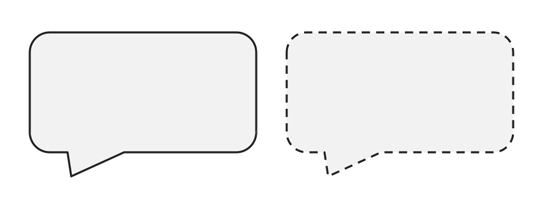
When you see a speech bubble outlined with a dashed line, you might interpret it as a whisper or an “off-stage” comment. When a new road or trail is planned, it is often displayed on a map as a dashed line, indicating it does not yet exist but is being planned for the future.
What factors affect dashed and dotted lines?
For several decades, vision researchers have explored what makes a particular form detectable in a noisy environment. This provides insights into how we perceive dashed lines. Although the purpose of much visual research is to create a mathematical model of human visual perception, I think these findings can be safely applied to the world of design and can generate a better understanding of visual communication.
Of particular interest is work done by William R. Uttal on the detection of dotted lines embedded in a noisy dotted background during preattentive processing. Here is a summary of his findings on what helps or hinders our detection of dotted lines in a crowded environment (Kiryati et. al.).
- Our ability to detect a straight dotted line strongly depends on the density of the points that lie in the straight line. (Greater density improves detection.)
- Our ability to detect a straight dotted line depends, up to certain limits, on the number of dots in the line.
- Our ability to detect a straight dotted line is insensitive to the orientation of the line.
- Our ability to detect a straight dotted line is superior to that of a curved or angled line and the decline in detectability does not decrease with increases in curvature.
- Our ability to detect a straight dotted line with irregular spacing between the dots in the line is substantially less than that of a straight dotted line with periodic spacing.
Interpretation of Dashed Lines
In visual language, the dashed line gives us a way to express the idea that something is not concrete. Something impermanent. It may be temporary; it may not currently exist (it will in the future or it did in the past); or it may be invisible or hidden. One way or the other, it represents what it is—not solid. As always, the context of the visual provides cues for accurate interpretation.
A Temporary State. The dashed line often represents something that is in a temporary or transitional state. In this context, it is used as a placeholder, indicating there is more to come. In the typography design games at the Method of Action website, they used a familiar placeholder technique to represent a temporary state, that a new game was coming soon. (The game, Colors, is now present.) Without the dashed line box, website visitors may not have understood the “coming soon…” reference. It worked as visual shorthand.
Something Vague or Insubstantial. The dashed line gives us the visual vocabulary to express something vague or abstract. This idea is even translated into corporate-speak. When someone is a “dotted line report,” it indicates the person is not a direct report, though there is some connection and accountability.
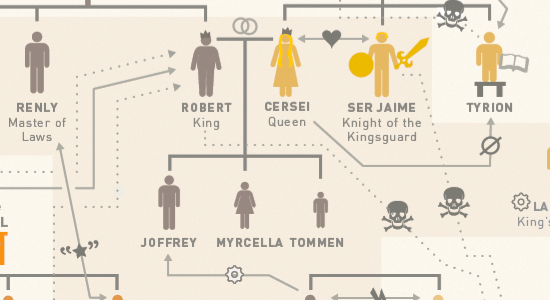
In the Game of Thrones Infographic below, relationships are diagrammed with two types of lines. Present relationships are indicated by a solid line; past relationships between characters are indicated by a dotted line. Dashed lines provide a more nuanced visual language. (Click the image to see the original.)
Soft Boundary. Because the dashed line can perceptually drift into obscurity, it’s often used as a gentle boundary for separating one topic or function from another. In web and user interface design, this unobtrusive technique provides the right effect without intruding on the viewer or user. On the rxbalance.com website graphic below, three product lines are separated with a dashed line, creating a clear yet subtle separation. As a soft boundary, the dashed line helps us perceptually group visual elements.
Hidden from View. When using a dashed line to create a diminished boundary, it can indicate the hidden parts of an object. By convention, technical and engineering illustrations use a solid line for what is visible and the dashed or dotted line to indicate concealed lines and edges. In Nigel Holmes’ illustration, “How to Choose the Correct Mountain Bike,” the dashed line around the seat indicates it is hidden. (You can see more of Nigel Holmes’ brilliant illustrations in Wordless Diagrams.)

Conclusion
Dashed and dotted lines are a fascinating example of an alignment between visual perception and verbal language. They are broken lines and as such, they provide a visual vocabulary to express impermanence, change and vague concepts. But there is one mystery about these lines I can’t figure out. Why do we say, “sign on the dotted line?”
References:
- Hoffman, Donald D. & Singh, Manish. (1997). Salience of visual parts. Cognition, 63, 29-78.
- Nahum Kiryati et. al., On The Perception of Dotted Lines. Image Science Laboratory, Institute for Communication Technology Swiss Federal institute of Technology, Zuirch, Switzerland.
- Singh, Manish and Donald D. Hoffman. Part-based Representations of Visual Shape and Implications for Visual Cognition. From Fragments to Objects: Segmentation and Grouping in Vision.
- Smits, J. T. S., Vos, P. G., & van Oeffelen, M. P. (1985). The perception of a dotted line in noise: a model of good continuation and some experimental results. Spatial Vision, 1, 163–177.
- Srimant P. Tripathy et. al. Detecting collinear dots in noise. Vision Research 39 (1999) 4161–4171.


{ 2 trackbacks }
{ 10 comments… read them below or add one }
Interesting discussion. ‘Sign on the dotted line’ implies permanence, as in agreeing to something formally, which suggests the opposite of something temporary and impermanent. People also tend to use dots and dashes differently. As a typographical element, dots provide a contrast to other shapes, adding emphasis, perhaps, rather than vagueness.
Hi Annie,
Thanks for your comments. I have no idea if the dotted line reference has anything to do with visual vocabulary or if it has some other roots. I was kind of joking, but it is interesting. When researching the etiology, one source said it was a way to get attention, to distract someone from the terms of a contract. A more reliable source from a book on idioms, says that it is simply a carry over from the lines on a legal document.
Best,
Connie
Excellent blog post, but can I suggest hiding that Game of Thrones infographic behind a click-through or marking it as a spoiler? I’ve been trying to avoid spoilers since the TV series began, and some of the information in that infographic (even the thumbnail) reveals plot elements I would have preferred to learn from the show.
Enjoyed your discussion! “Sign on the dotted line” is consistent with it, if one assumes that the signature is what’s important. In effect, “dotted line=no line,” giving exclusive visual focus to the signature.
Thanks,
Susan
That makes sense. Thanks for your input!
When I see the dashed lines it associates with something that could be edited or changed. I think this association comes from the kids books where you could connect the dots to outline a illustration or cut the paper by following the dashed lines path. Also when I see dashed lines, they recall small holes on the paper of airplane tickets that form a line, that bring the some kind of a feeling of a possible interaction.
Hi Tim,
Your associations are really interesting. Thanks for sharing them. It’s cool to see the range of how people interpret visual language.
Connie
A big reason that dotted lines seem less dominant is that they actually stimulate fewer neurons in the visual cortex of the brain. A solid line stimulates response in an uninterrupted line of edge-detection neurons. The perception of a meaningful edge is very strong. A dotted line stimulates a response in a broken line of edge detection neurons, and so our perception of an edge is weakened.
So a dotted line is a perfect place to sign, since it is noticeable as a wayfinding device when there’s nothing else there, but is dominated by the much stronger solid line of the signature when it’s put on the paper.
Interesting post – my new class are getting another reading assignment on Friday. 😉
Tom
Hi Tom,
Your comment about edge-detection neurons is a great addition to this article. Thanks!
Connie
A dashed or broken line on a box edge like on a form document means information from inside the box can pass thru to the box next to it essentially making a larger box but also hiding the fact the say 3 boxes with interior broken line act like on big 3 word name so instead of first middle and last names you have one name made up of three parts . See a california birth certificate to see the broken lines on the right of the frirst box and the left of the third box