Experts say that a person’s behavior on the web is highly goal-driven. People have things they want to accomplish, whether it’s making a purchase, finding a recipe or learning how to do something new. Inherent in many web page designs, therefore, is information to help a user perform an action. For example, if you design a button that must be clicked to reach a desired goal, such as placing an item in a shopping cart, then shadowing the button so it appears to be raised will help your audience understand that the shape is a clickable object.
In addition to these types of visual cues, we often write instructions to assist users in knowing what to do next. These instructions guide the eyes and minds of the individual to look at the appropriate place and to take the appropriate action.
Mental Models
Designing and writing the instructions that are part of the user interface design is both an art and science, involving copywriting and design skills as well as an understanding of how people use mental models. Mental models are a generalized idea of how things work. They are an efficient and speedy cognitive mechanism. People apply their mental models to new situations so they don’t need to relearn everything from scratch. This means people will apply their stereotype or mental model of similar websites to how your website works.
If Things Go Wrong
This is one of the main reasons user interface instructions are so important. People have an unpleasant experience when their mental models are inaccurate or incorrect. It causes frustration, user errors and a failure to accomplish a goal. A frustrated user might look for another website that’s easier to use.
Writing easy to understand instructions and presenting them aesthetically can ward off these types of problems. Good instructions will guide website visitors, even if their mental models are imprecise or erroneous.
Text and type are so finely integrated into website design, that it seemed appropriate to include this topic on a site that focuses on understanding graphics. So here are some guidelines for writing user interface instructions that I’ve gleaned from years of designing online learning as well as gems from usability research.
1. Know your audience
 You could say that the advice, ‘Know your audience’ is an overused cliche. On the other hand, you have nothing without an audience, so site visitors are of primary importance. When you know the characteristics of your audience, you can imagine them and direct your words to them. Unless your visitors are a savvy, homogeneous group, it’s best to assume they’ll need some guidance to achieve their goals.
Notice the example above. The humorous instructions on the Captcha form could only work with a sophisticated and experienced audience. Inexperienced computer users and those who are not fluent in English would have no idea that ‘Verify you’re human’ means to type the alphanumeric characters in the box.
2. Balance brevity with getting the point across
Finding balance is always an issue. When writing user interface instructions, include enough detail so users know exactly what to do, but not so much detail that it becomes difficult to process the information. People can only process small amounts of information at one time.
You can help the situation by writing instructions in plain and simple language, which should help visitors accomplish their tasks efficiently and quickly. Try to use short sentences when possible. For example, this sentence could easily be broken into two: ‘Click the Add to Cart button, then click Check Out at the top of the screen.’
3. Remove irrelevant information

This guideline goes along with the brevity advice above, but is often best to do at the end of the writing process. At the end, you look at your writing from a different perspective. It’s easier to see which information is irrelevant, because it adds to the confusion quotient. Deleting extraneous and superfluous details will tighten up the final copy. Some might think the instructions above include irrelevant information. Are there some words or phrases that could be removed?
4. Select the most effective and accurate words
The task of writing accurately involves a subtle discrimination between words with similar meanings. Usability research shows that people scan a web page rather than read it. Thus, your wording should communicate effectively while someone is on the fly and barely paying attention.
 Use words that promote clarity. ‘Select a date’ is okay, but ‘Click on a date’ is more accurate. Avoid double negatives, such as ‘I do not want to unsubscribe.’ Also, stay away from jargon that some people won’t understand, like industry acronyms and technical terms. Speaking of precision in word choice, when you look at this menu on the right, do you understand the difference between Explore and Browse? Just wondering.
5. Write in the active voice
The active voice is crisp and clean and will move people to take action. The passive voice makes readers yawn. Compare this sentence in both voices: active— ‘Click the Journal link to search for an article.’ and passive—”The Journal link should be clicked when you are ready to search for an article.’
6. Place the instructions aesthetically
Designing user interface instructions can be a challenge. You must determine where they belong in the visual and information hierarchy. Although they need to be noticed by users, they shouldn’t have so much salience that they overpower the page. And as a design element, they must fit in well with the surrounding environment. Bottom line: Plan for text during the initial phases of design.
7. Communicate relationships through vertical spacing
If the instructions are longer than one line, it’s important that readers know which instructions belong together. The leading (or vertical spacing) between related sentences should be large enough to enable legibility yet close enough to show the sentences are associated. When there are several steps, keep each step separate by increasing the line spacing. Number the instructions if they are complex or will be perceived as such.
8. Select a typeface that enhances legibility
Think hard about the type as a design element. Use a typeface and style coherent with the rest of the site design. Consider the size of the font. The user instructions must be legible by people of all ages. Avoid bit-mapped text whenever possible, so that users can enlarge the text if necessary.
9. Use graphics if they will help you communicate

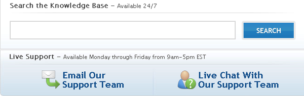
Yep. Sometimes it’s nearly impossible to say something in words. A graphic provides support and makes text comprehensible, as in this explanation of where to find your account number on a magazine label.
10. Make it personal
 It’s okay to add a little personality to your user interface instructions and system messages. It might help your visitors have a pleasant or humorous experience. Just ensure that your between-the-lines message can never be interpreted as a put-down. For example, the instructions above help visitors feel better. After reading the message, you don’t feel like such a loser for failing to keep passwords in a place where they can be found.
11. Make Your Instructions Accessible
This guideline was suggested by a reader and should have been included from the start. It’s important that your small print instructions can be read by people who have difficulty reading small print and/or use devices to read computer screens.
Some basic accessibility guidelines for writing user interface instructions are to: avoid using graphical text so it can be enlarged (discussed in #8 above); provide text alternatives to graphical content so it can be translated into other forms, like Braille; and clearly separate the instructions from the background so they can be easily seen. In addition, use hyperlinks contextually so that they make sense if the person can’t see the screen. For example, a link that states, ‘Instructions for using this form’ is better than a ‘Click here’ link.
12. Test your instructions
Test instructions with sample audience members, people outside of your office and with no prior knowledge of what it is you are doing. Observe one or more people performing the task for which you’ve written instructions. Note any difficulties they have and revise the instructions. Repeat the process until people accomplish the task without problems.
Let’s hear your ideas. Please share your guidelines in the Comments section.
If you like this article, share it!
{ 7 trackbacks }
{ 11 comments… read them below or add one }
If you don’t know your audience, then make it as asaccessible as you can.
#1> This page, for instance is hard for me to read without using the “larger” type size and my choice of font. (I have IE8 set for Bold.) However, the lines stretch all the way aross the screen and I am uncomfortable with more than half the screen width. I can’t reduce it without word-wrap being enabled.
#2> In this text entry box, my choice of font has not been enabled, nor has text size. The rsulting font is small and wimpy, hard for me to read and I am likely to miss my errors. When I enlarge it withFn+Spacebar, its lines extend outside the screen and I don’t see the whole line.
So, on the whole, this page is just ever so slightly ELDERLY UNFRIENDLY.
===gm===
Thanks for your feedback, GF. I did check it for an enlarged font using both Command + (Mac) and Ctrl + (PC), but didn’t run into the same problems you did. I’ll have to look into this. Making it as accessible as possible is an extremely important guideline and an oversight on my part. I think I’ll just add it to the list!
I like to indicate the necessary time to complete the form.
Great blog!
Great idea, Santiago. Thanks!
Thanks for a spot on article!
Great article. Testing is often the missing link I find people neglect, but as you say it can be done quite effectively just by asking a few people who are unfamiliar with the product to complete the desired tasks and watching them, can really get a decent review fairly easily. So yeah, don’t be afraid to ask a few friend or colleagues for a few minutes of their time 😉
Hi Ian. Yes it is amazing how even a small amount of testing can produce good results. I think you can catch most of the difficulties with the first few testers. It’s also amazing (to me) how difficult it is to see an interface from the users perspective, as hard as one might try. Testing cures that problem. Thanks for the comment.
Many usability and accessibility advocates advise interface writers to use phrases lke “select checkout” rather than the more specific “click the checkout link” because, as you note near the end of the post, such language excludes many users with disabilities as well as those using touchscreen devices, etc.
Any thoughts on this? I’m of two minds about it, since “click” language seems to perform better for the majority of users. Perhaps it’s time to do some field research with blind users, users of mobile devices, and so on to see how that kind of language is actually perceived.
Good insight, Erin, thanks. I don’t think I’m expert enough in accessibility to provide an opinion and we do need more research on this issue. I guess the question I would have is whether most people using alternative input devices are able to mentally translate words like “click” into “select” or if that makes performing an action too confusing because of all the possibilities. It would be good to hear from the community on this.
Are the examples you include good examples or bad examples?
Hi Jose,
Is that a trick question? Actually, there is a mix of example types but it is all explained in the text.
Connie